设计师实用英语第二课
小编:大家还记得上节课的设计师实用英语第一课都有哪些知识点吗?记得去复习下哦。头痛的英语还是的得看,吃点药,忍忍就好啦。。让我们跟随@网秦uec的译者一起学习第二课去吧。
Designing for Mobile, Part 2: Interaction Design
移动端设计——第二节:交互设计
In the second part of her series on Mobile,Interaction (交互)Designer Elaine McVicar builds upon her working definition of mobile Information Architecture. She provides numerous examples of mobile design patterns and explains how they differ when compared to their desktopcounterparts(对等方).
在本系列的第2节中,交互设计师Elaine McVicar将继续讲解有关移动设计信息架构的知识,并提供大量有关移动端设计模式的范例,为大家解释它们与电脑端设计模式的区别之处。
My first mobile phone, a Nokia 5110 (purchased in 1998!), offered very few features: I couldcall(打电话),text(发短信)or play Snake. What’s more, these interactions were completely controlled by the manufacturer. With the advent ofsmartphones(智能手机), touch screens, and “app stores,” however, the opportunities for designers are now innumerable. It’s incumbent upon us to familiarize ourselves with the conventions of this still-relatively-newmedium(媒体、媒介,Media的单数形式).
我的第一部手机是诺基亚5110(1998年买的),功能非常有限:电话、短信、贪吃蛇。另外,手机所能进行的全部交互都在制造商的掌控之下。而智能手机、触摸屏和“App store”的出现,给设计师带来了巨大的机遇。因此,我们现在需要尽可能地熟悉、了解智能手机这种相对还比较新颖的媒介。
Welcome to Designing for Mobile, Part 2: Interaction Design. Here’s somebackground(背景)in case you’re just joining us mid-series: Designing for Mobile, Part 1: Information Architecture demonstrated the key challenges designers face when designing for mobile, primarily the mobile context: from viewing conditions, to behavior and emotion. Because these differences impact the user, I explained that it’s important for us to consider them throughout our design process – from research and strategy to creating the final product.
欢迎来到移动端设计第2节:交互设计。下面是有关本系列的一些背景资料,方便新加入的同学跟上节奏:移动端设计——第一节:信息架构代表着设计师进行移动端设计时所面临的几项关键难题,这些难题主要是移动端的环境:从视觉条件到行为再到情感。考虑到移动端与传统设计之间的区别给用户带来的影响,我在上一节中说明了我们在从到策略再到最终产品这一整套设计流程中对这些区别详加考虑的重要性。
Part 1 concluded with an exploration of information architecture in the mobile context. This provides a good foundation for the rest of the design process. Before jumping intoaesthetics(审美), though, it’s important to understand how mobile and tablet interactions differ when compared to their desktop counterparts.
在第1节中,我们对移动环境下信息架构模式的探索进行了总结。信息架构是设计流程其余部分的基础。在进入设计审美部分之前,我们务求了解手机和平板电脑交互与传统台式电脑交互之间的区别。
THE DESIGN OF INTERACTIONS
交互设计
Mostmodern(现代的), mobile devices employtouch screens(触摸屏); which provide their own set of opportunities and constraints. We use them not only to view content, but also to interact with that content. This forces designers to consider ergonomics,gestures(手势),transitions(过渡效果), and finally, mobile-specific interaction patterns.
大部分现代移动设备都采用了触摸屏,而触摸屏有着自己独特的优势和局限性。我们不仅要使用触摸屏查看内容,还要与内容进行交互。这就使得设计师要考虑如何设计出符合人体工程学的手势和过渡效果,以及专门针对移动端的交互模式。
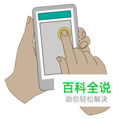
ERGONOMICS
人体工程学
Designing for mobile ergonomics requires that we pay attention todevice dimensions(设备尺寸)as well as the pragmatic concerns oftouch screens.The way a user holds a deviceand touches the screen, for example, influences how easy it is for that user to reach parts of the screen.
移动端人体工程学的设计要求我们既要考虑设备尺寸,也要思考触摸屏在实际应用情况下的各种问题。举例来说,用户拿设备和触摸屏幕的方式决定着他们能否轻松够到屏幕的各个部分。
Hit areas(点击区域), or “areas of the screen the user touches toactivate(激活)something” require adequate space for the user to accurately (and confidently) press.The average fingertip is between one to two centimeters wide, which roughly correlates to somewhere between 44px and 57px on a standard screen and 88px to 114px on ahigh-density (高密度)(“retina”(视网膜))screen.Nokia,AppleandMicrosofteach recommend slightly different sizes to account for the nature of touch screens.
点击区域,或者叫“用户为激活某对象所需触摸的屏幕区域”需要有充分的空间以便用户准确(及自信地)操作。一般人的指尖宽度是1到2厘米,大概对应标准屏幕的44px到57px,或者高密度屏幕(视网膜屏)的88px到114px。考虑到触摸屏的区别,诺基亚、Apple和微软在这方面的推荐大小彼此之间有着细微的差别。
Yet there are nohard and fast rules(固定不变的,可以直接套用的规则)with regards to hit areas. Instead of looking to the various standards for an answer, simply consider what the user needs to achieve on the screen, how important that task is, and how quickly they need to complete it – then design accordingly.
不过,在点击区域这一方面,并没有硬性的规定。你完全不用费劲查看各种标准来寻求既定的答案,只需要思考用户要在屏幕上实现什么目的、其待实现目的的重要性如何,以及需要完成的速率,然后相应进行设计
GESTURES
手势
Each part of a touchscreen dedicated to functionality precludes the display of content in that area, making gestures a crucialcomponent(组件、组成部分)of mobile interaction design. All of the major touch operating systems employ them, including:Google’s Android,Apple’s iOS, andMicrosoft’s Windows 8.
触摸屏上专用于某些功能的区域部分是无法显示内容的,这也就使得手势成为了移动交互设计的一个关键组成部分。现在所有的主流触摸操作系统都采用了手势,其中包括:Google 的 Android、Apple 的 iOS和Microsoft的 Windows 8。
The table below provides a brief summary:
下表是对各种手势的简单汇总:
| Action操作 | iOS | Android | Windows 8 |
Press点按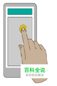
|
Selects primary action选择主要操作 | Selects primary action选择主要操作 | Selects primary action选择主要操作 |
Long press长按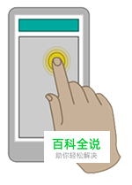
|
In editable text display magnified view forcursor(光标)positioning在可编辑文本中显示放大视图以便进行光标定位 | Enter data selection mode进入数据选择模式 | Showtooltip(工具提示)without selecting the item.显示工具提示但不选中对象。 |
Double press双击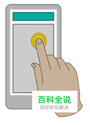
|
Zoom in or zoom out(放大或缩小) | Zoom in or zoom out. Also used for text selection放大或缩小,也用于选择文本 | No standard无 |
Small swipe小幅度滑动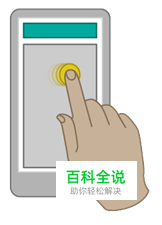
|
Reveal a delete button bysliding(滑动)horizontally on a table view在表格视图下横向滑动显示删除按钮 | No standard无标准 | Selectobjects(对象)in alist(列表)orgrid(网格)by sliding perpendicular to panning direction向正交方向滑动以选择列表或网格中的对象 |
Large swipe大幅度滑动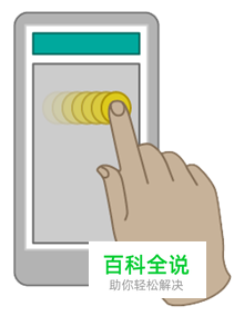
|
Scroll(滚动)across content滚动内容 | Scroll across content or navigate between views within the same hierarchy滚动内容或在同一层级的不同视图之间进行导航 | Scroll across content Also used for moving, drawing or writing滚动内容,也可用于移动、绘画或书写 |
Pinch / spread捏/放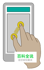
|
Zoom in or zoom out | Zoom in or zoom out | Zoom in or zoom out |
Additionally,standards and patternshave emerged for developing gestures ontouch-based devices(基于触摸的设备). Designers can – and often should – push the boundaries of gestures to suit their application.
另外,关于触摸屏设备手势的开发也出现了一定的标准和模式。设计师可以,也应当根据自己所设计应用的情况拓展手势的疆界。
TRANSITIONS
过渡
Transitions are interactions that smooth the boundaries between application states, helping to tell a story or (re)establish a gestural metaphor. More generally, transitions help facilitate recall and prevent users from getting lost.
过渡是指让应用内不同状态之间界限变模糊的交互操作,其有助于故事的讲述或奠定手势的含义。在更多情况下,过渡可以帮助用户回忆过往内容,防止他们“迷路”。
(下面的内容作为大家两节课来的小测试,请大家结合图片琢磨一下过渡效果说明和用法的英文意思,这里就不给出翻译了)
Basic transitions include:
基本的过度方式包括:
| Gesture | Transition | Description | General usage |
| Press |
Quick change(快速变换)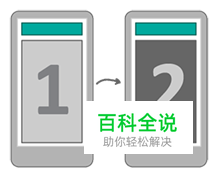
|
The view changes without any animation. | When changing between two different types of tool or content. |
Expand扩展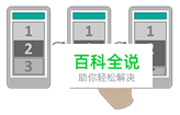
|
An item on the screen expands pushing content along or down | When expanding a list of content within a screen. | |
Flip翻转
|
The view flips over as if turning around from back to forwards | When viewing a screen specifically related to the previous screen, e.g. additional settings or information. | |
Open to full screen全屏打开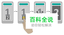
|
An item on the screen opens/expands to fill the full screen. | When opening or viewing an item. This transition can also be inverted to close an item. | |
| Swipe |
Horizontal slide along(水平滑过)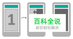
|
The view slides left or right, pushing the previous view out of the screen. | When moving forward to view new and related content, or back to a previous screen. |
Horizontal slide over(水平划过覆盖)
|
The view slides left or right, over the previous view | When viewing supporting or additional content. |
截止到这里,第二节课结束了,但是这篇文章还没有讲完,剩下的内容请大家参加译文和原文自学,并敬请期待我们的第三课!
附赠第二课单词表:

UXBOOTH
译文地址:网秦

